MENU
back
en
The manual provides communications standards and templates ranging from graphic and digital media templates. To get more details download the full Swisscontact corporate design manual.
Our logo is locked together in spacing, size, colour and proportion and must not be altered.
Specific colours are assigned to the logo and should always be adhered to as specified here.
Where possible, the logo should appear in full colour on a white background. If there are printing restrictions, the logo may also appear in single colour black.


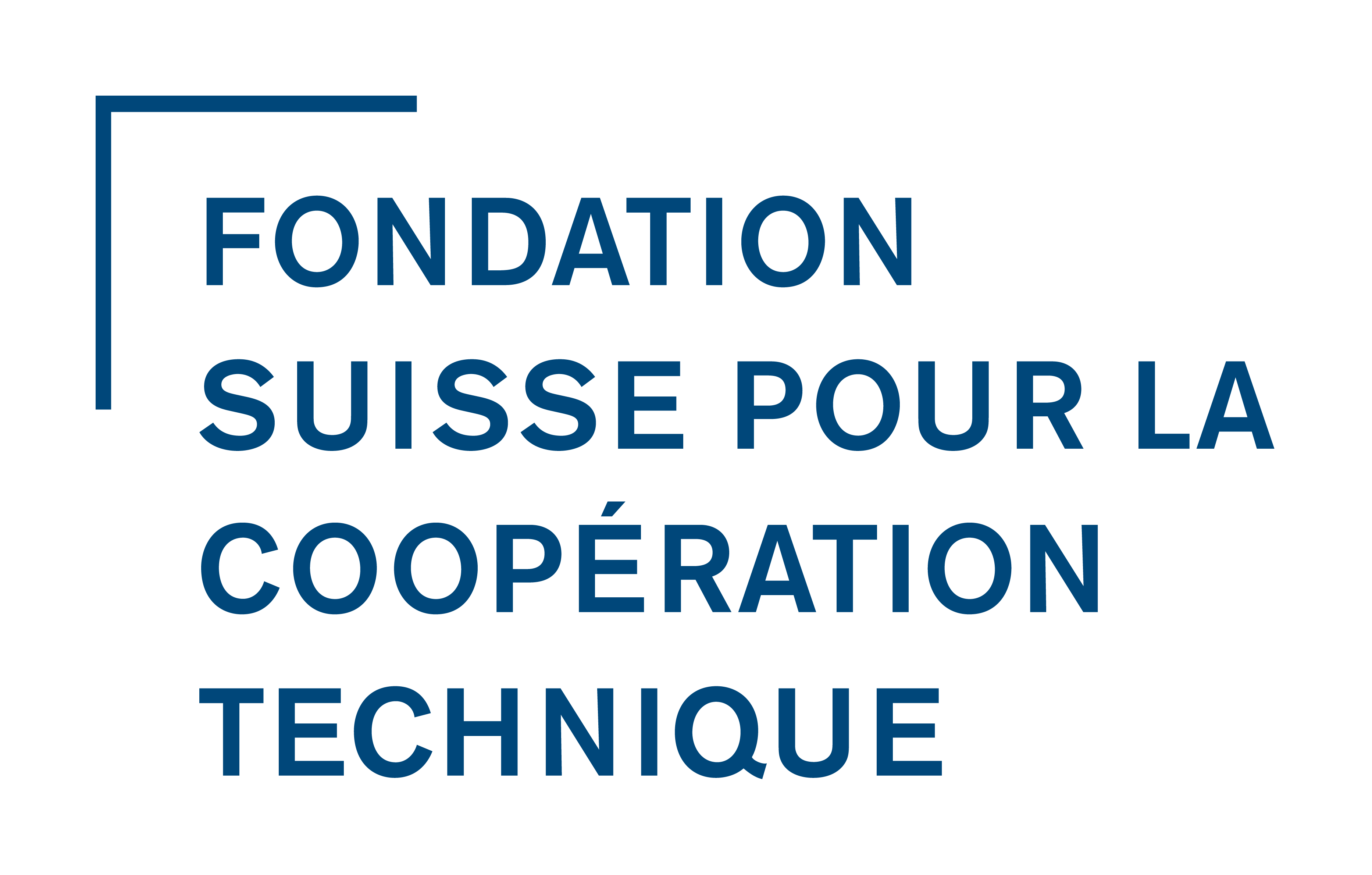
The foundation logo (Swiss Foundation for Technical Cooperation), should be placed alongside the Swisscontact logo in a prominent position. The preferred placement is below the Swisscontact logo and to the left of the layout. It can appear in the white area next to the Swisscontact logo or on top of the image area in blue or white.
The foundation logo should always appear on:
The official foundation name may appear in the relevant publication’s language as required and as indicated here. We mainly communicate in four languages German, English, Spanish and French.
The world map appears as a circular device. There is a corporate version which includes all continents, as well as four regional versions (Africa, Asia, Latin America and Europe). The regional maps are used for region-specific collateral.


The world map can be used in full colour (blue and white), or as single colour white or blue.
The primary colour palette consists of the Swisscontact blue, Swisscontact grey, cold grey and warm grey. These colours may be used in all collateral, and tints of these colours are allowed for graphs, tables and colour blocks.

The secondary colour palette consists of colours intended for the design and structuring of documents and can be used for colour blocks and graphics.


Mulish is the digital typeface for electronic and web based communication.
ABCDEFGHIJKLM
NOPQRSTUVWXYZ
abcdefghijklmnop
qrstuvwxyz
1234567890
Available weights: Regular, Semi-Bold, Bold
EB Garamond is the digital typeface to use for web based headlines.
ABCDEFGHIJKLM
NOPQRSTUVWXYZ
abcdefghijklmnop
qrstuvwxyz
1234567890
Available weights: Regular, Semi-Bold
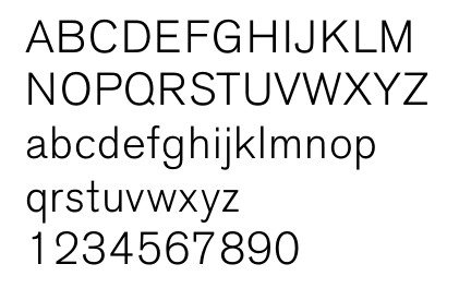
Calibri is the digital typeface for electronic communication and word processing documents where the primary and secondary typeface cannot be used due to technical constraints.
ABCDEFGHIJKLM
NOPQRSTUVWXYZ
abcdefghijklmnop
qrstuvwxyz
1234567890
Available weights: Light, Light italic, Regular, Regular italic Bold, Bold italic
Primary typeface Akzidenz Grotesk is the primary typeface for use across all applications which include headlines sub-headings and body copy.
Available weights: Italic, Medium Italic, Semibold Italic, Bold Italic
Secondary typeface Garamond Italic is the secondary typeface used to highlight pull-out copy, testimonials, case studies and quotations.
ABCDEFGHIJKLM
NOPQRSTUVWXYZ
abcdefghijklmnop
qrstuvwxyz
1234567890
Available weights: Italic, Medium Italic, Semibold Italic, Bold Italic
Google Font "Mulish", font-size 52px, font-weight "semi-bold"
Used for main page headline.
Google Font "Mulish", font-size 40px, font-weight "regular"
Used for headlines in content.
Google Font "Mulish", font-size 26px, font-weight "bold"
Used for headlines in content.
Google Font "EB Garamond", font-size 60px, font-weight "semi-bold", font-style "italic"
Used for main headline on the root/home page.
Google Font "Mulish", font-size 17px, font-weight "regular"
Lorem ipsum dolor sit amet, consetetur sadipscing elitr, sed diam nonumy eirmod tempor invidunt ut labore et dolore magna aliquyam erat, sed diam voluptua. At vero eos et accusam et justo duo dolores et ea rebum. Stet clita kasd gubergren, no sea takimata sanctus est Lorem ipsum dolor sit amet.
Text alignment is a paragraph formatting attribute that determines the appearance of the text in a whole paragraph or title. All our content is left-aligned and never justified.
Lorem ipsum dolor sit amet, consetetur sadipscing elitr, sed diam nonumy eirmod tempor invidunt ut labore et dolore magna aliquyam erat, sed diam voluptua. At vero eos et accusam et justo duo dolores et ea rebum. Stet clita kasd gubergren, no sea takimata sanctus est Lorem ipsum dolor sit amet. Lorem ipsum dolor sit amet, consetetur sadipscing elitr, sed diam nonumy eirmod tempor invidunt ut labore et dolore magna aliquyam erat, sed diam voluptua. At vero eos et accusam et justo duo dolores et ea rebum. Stet clita kasd gubergren, no sea takimata sanctus est Lorem ipsum dolor sit amet.
Lorem ipsum dolor sit amet, consetetur sadipscing elitr, sed diam nonumy eirmod tempor invidunt ut labore et dolore magna aliquyam erat, sed diam voluptua. At vero eos et accusam et justo duo dolores et ea rebum. Stet clita kasd gubergren, no sea takimata sanctus est Lorem ipsum dolor sit amet. Lorem ipsum dolor sit amet, consetetur sadipscing elitr, sed diam nonumy eirmod tempor invidunt ut labore et dolore magna aliquyam erat, sed diam voluptua. At vero eos et accusam et justo duo dolores et ea rebum. Stet clita kasd gubergren, no sea takimata sanctus est Lorem ipsum dolor sit amet.
Images can be used in 3 different sizes (medium, large, full-size) and in groups of 2 images each row. The example below shows a medium-sized image.